

Schweppes – A Premium Visual Identity
Visual identity, Packaging system
Upgrading Schweppes’ visual identity to reinforce premium cues while ensuring consistency across six African markets.
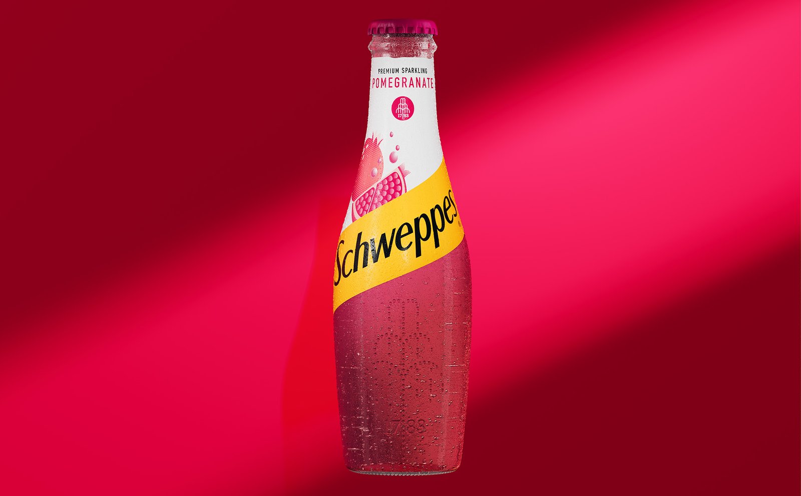
BACKGROUND
Schweppes is an iconic brand with a rich heritage, but its packaging and visual identity in Africa lacked clarity and cohesion. Our challenge was to:
Enhance premium appeal while maintaining brand recognition.
Create a simplified, scalable design system adaptable across all platforms and flavor variants.
Future-proof the visual identity, ensuring it thrives beyond packaging into a broader brand ecosystem.
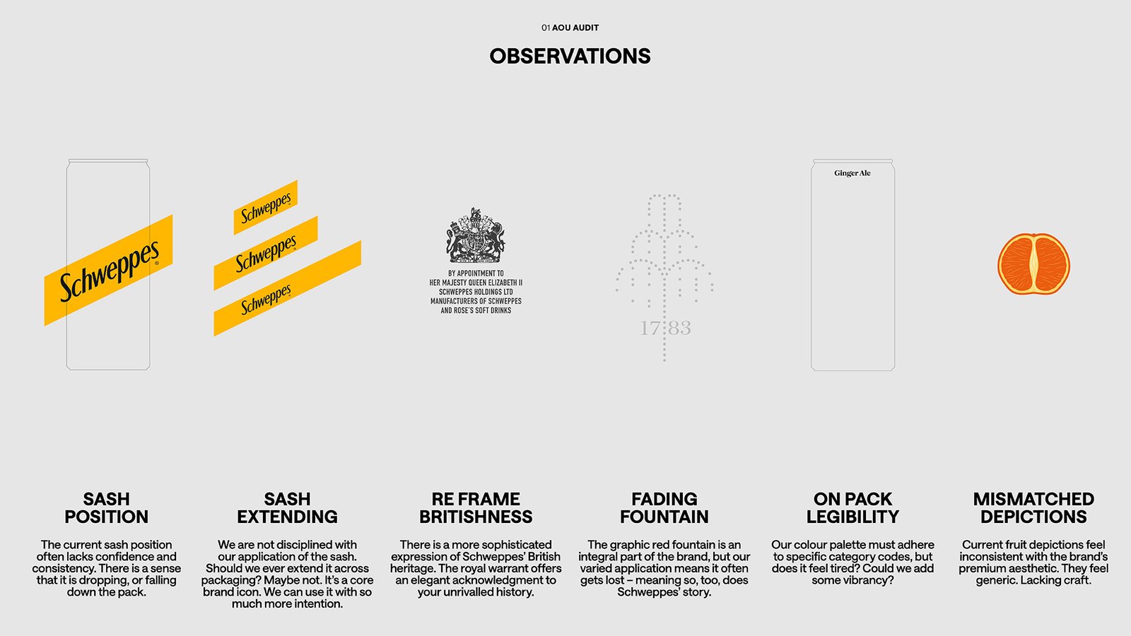
REDEFINED THE VISUAL IDENTITY
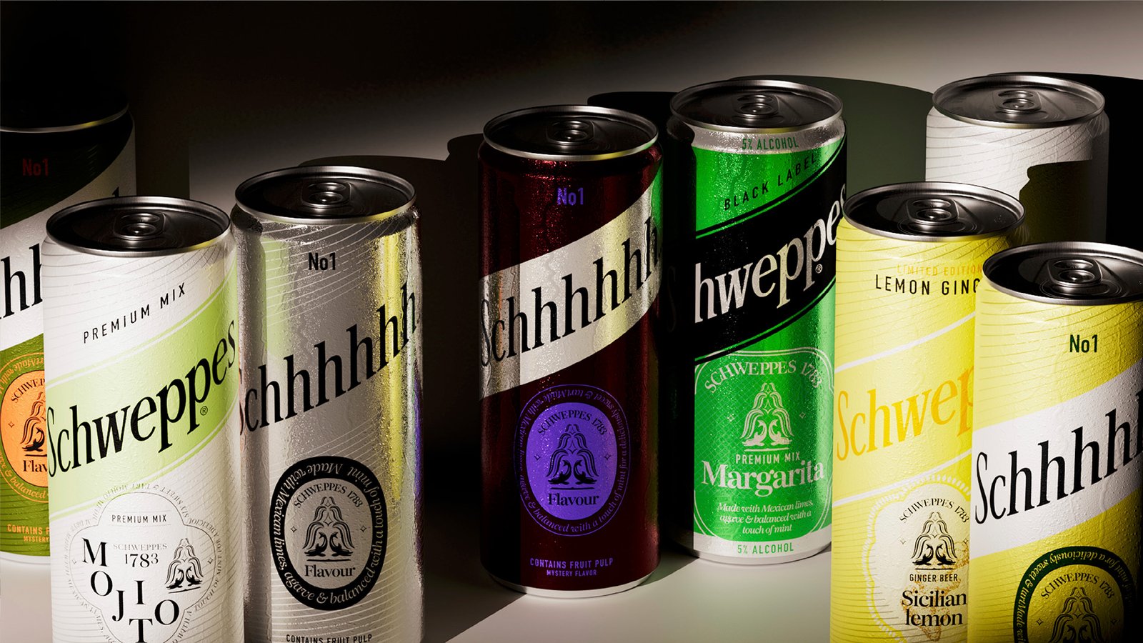
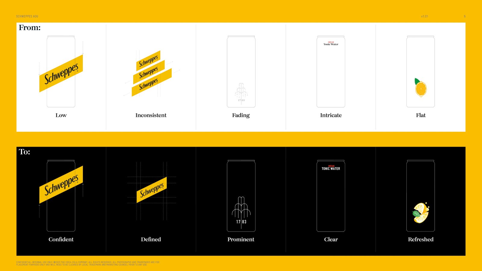
Stripped back unnecessary elements to create a cleaner, more elegant design.
Enhanced typography, color balance, and the yellow accent to emphasize sophistication and quality.
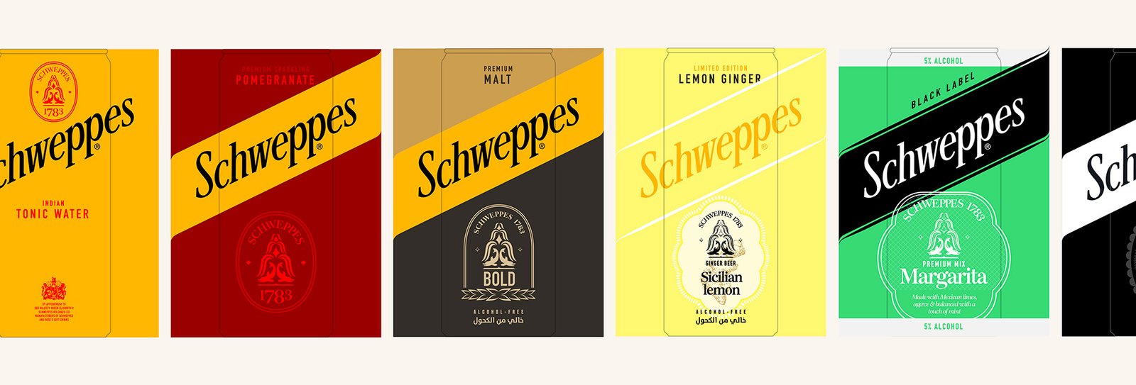
Ensured brand consistency while allowing for subtle flavor differentiations.
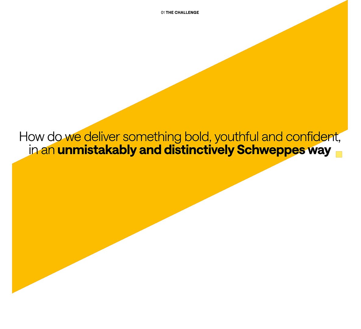
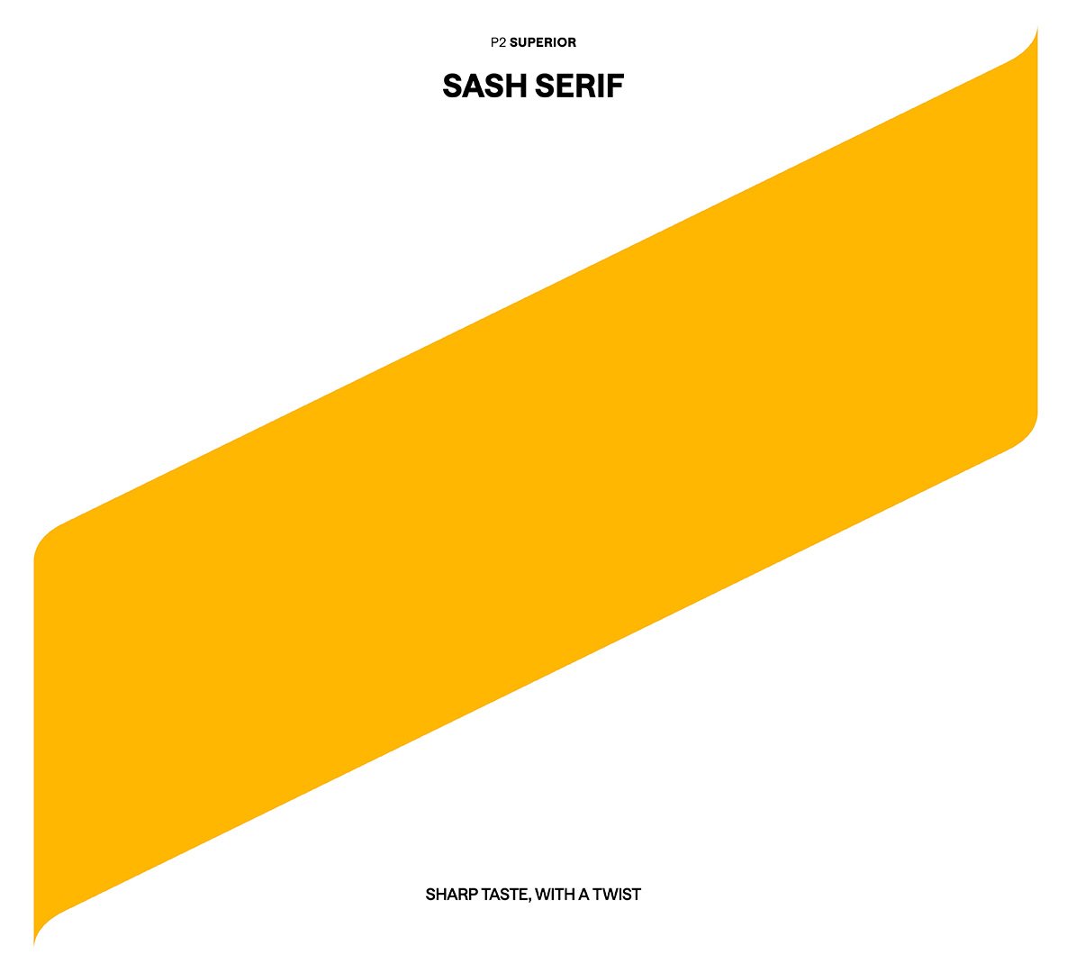
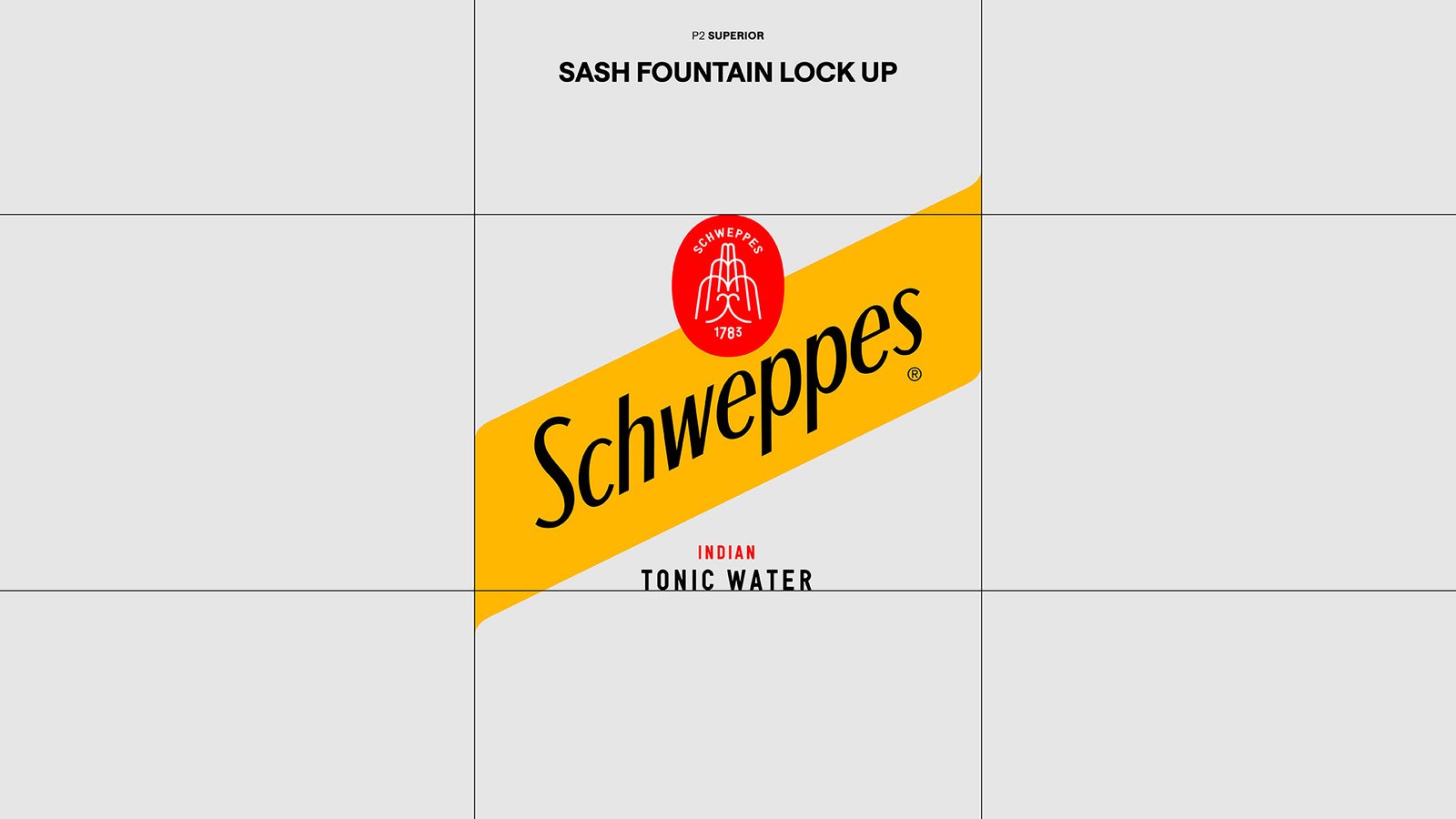
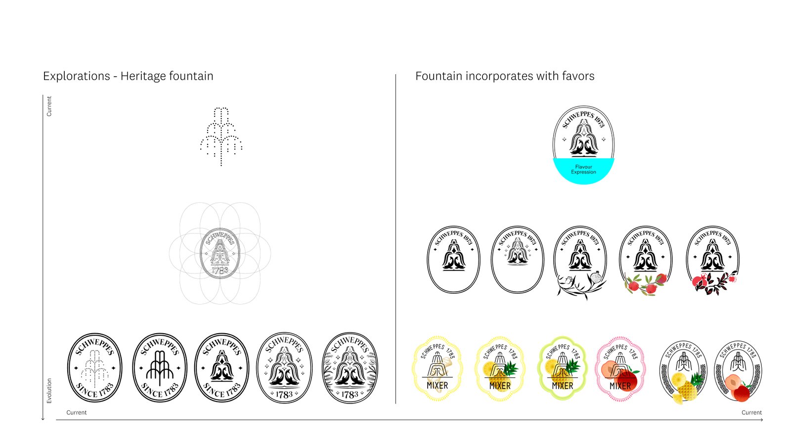
MODERNISED & STRENGTHENED THE HERITAGE ICON
Developed a streamlined layout that makes the Schweppes logo and product benefits the focal point.
Introduced a more refined hierarchy, improving legibility and shelf impact.
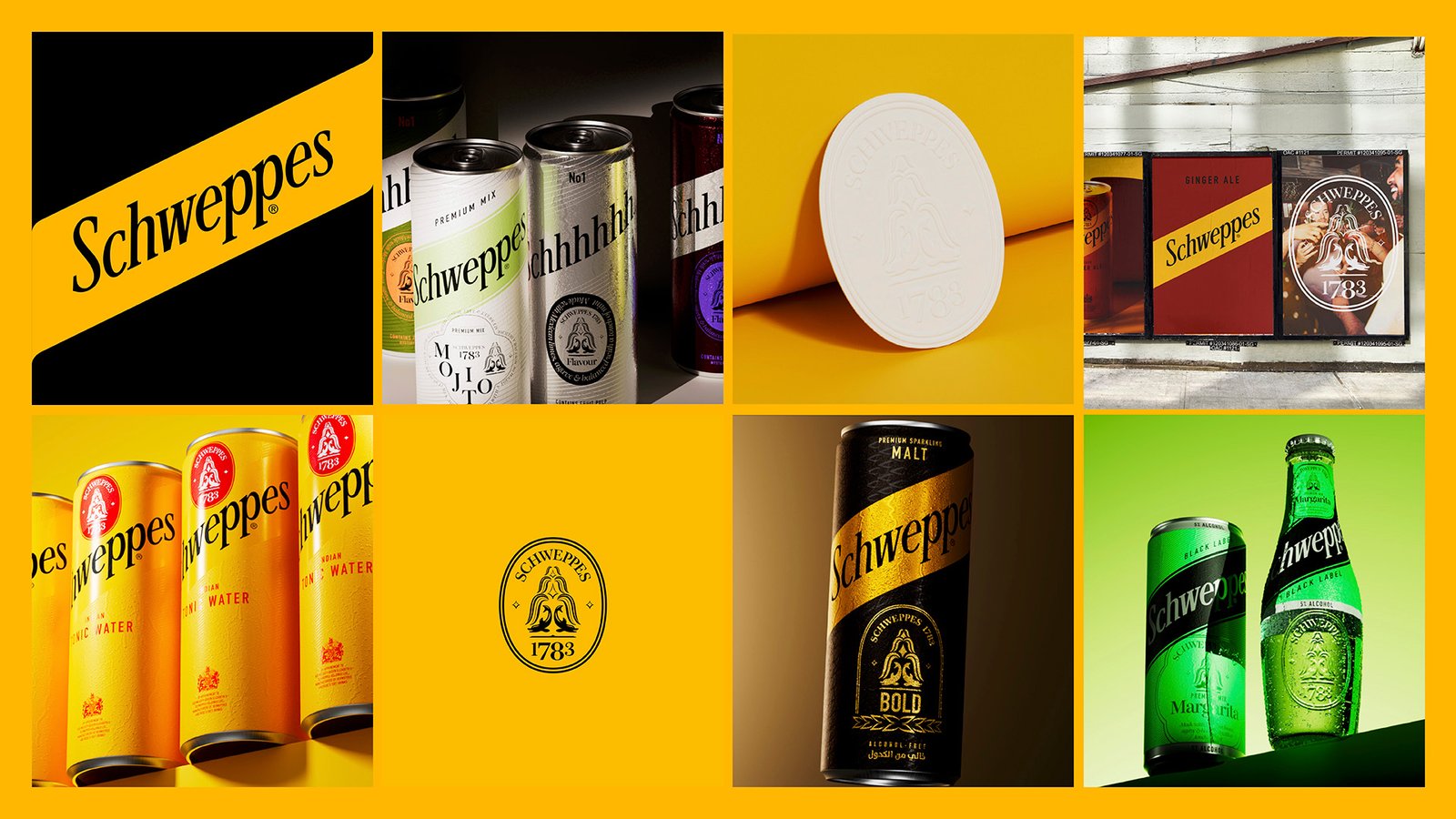
Created a cohesive look across all flavors, balancing heritage and modernity




BEYOND PACKAGING
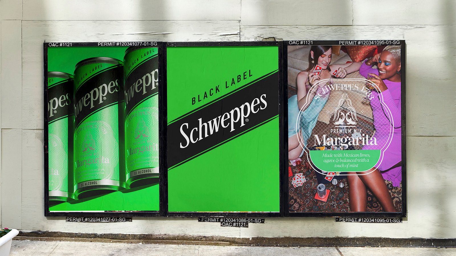
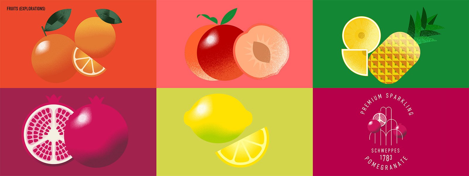
Designed a comprehensive brand toolkit to ensure visual consistency across digital, print, and retail environments.
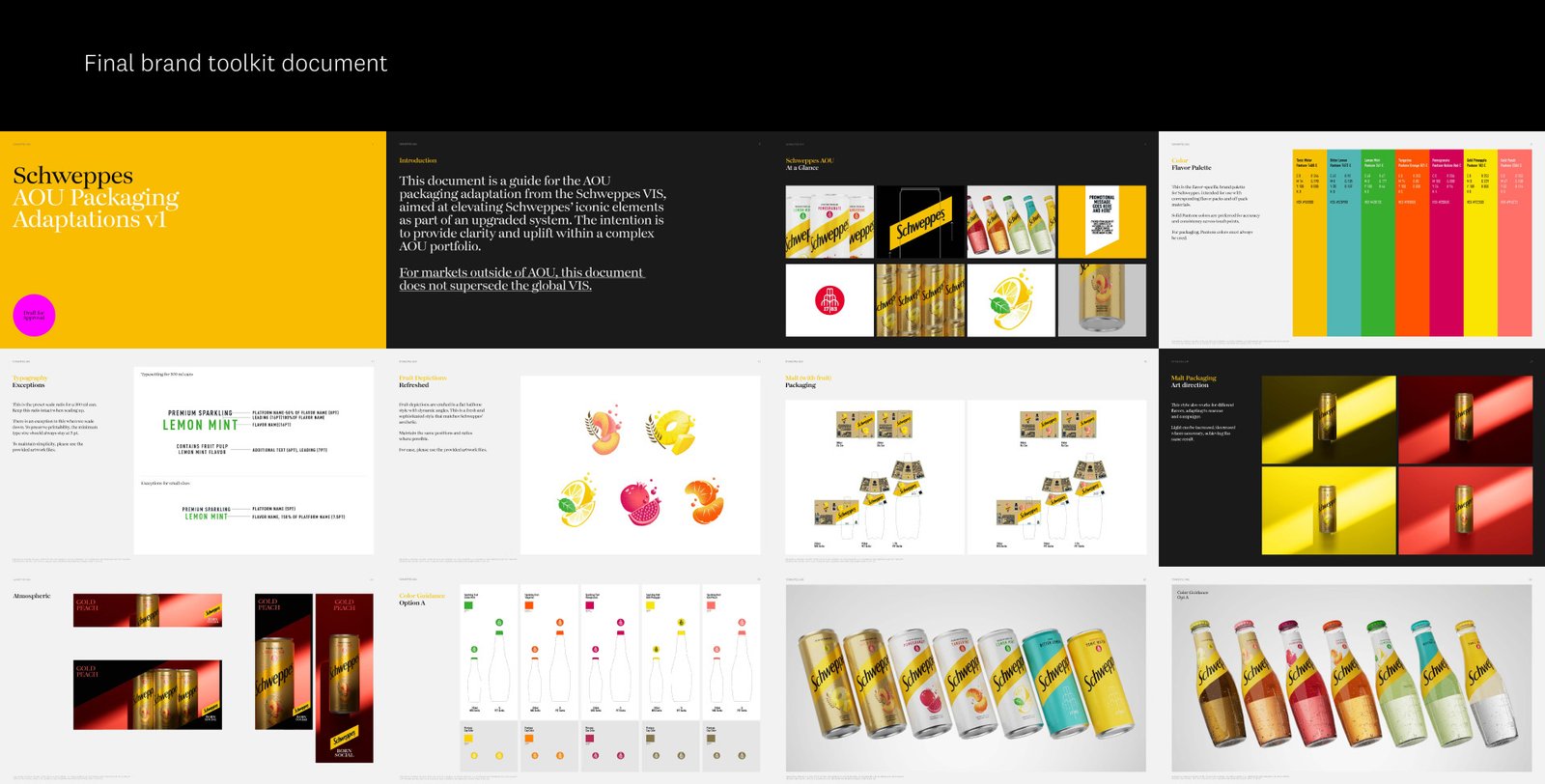

Project with Ultralight | Role: Packaging, Icon/Lockup, Illustration, Application | Worked with Creative director, motion designer, copywriter, and 3D artists.
yuen.luu@icloud.com
+44 (0)7542090218 | Manchester, UK