

Defender Awards
Identity, Graphic assets
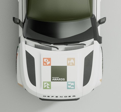
Epic. Heroic. Purposeful. Built from the brand's most valuable asset, the identity of Defender Awards stands for everything we contribute to our communities.
BACKGROUND
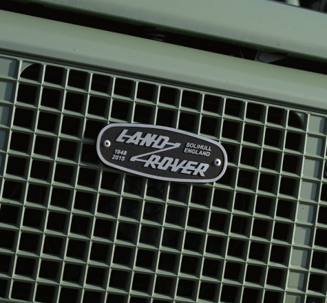
Collaborated with JLR brand team, we crafted a flexible graphic identity for Defender Awards. The design story reflects the landscape in which Defender was born, designed to roam the land, the brand has always utilised its ultimate capability to protect and explore.

CONCEPT & DEVELOPING THE VISUAL LANGUAGE
Distilling it down to the brand's core foundation to ensure we remain authentic today and into the future.
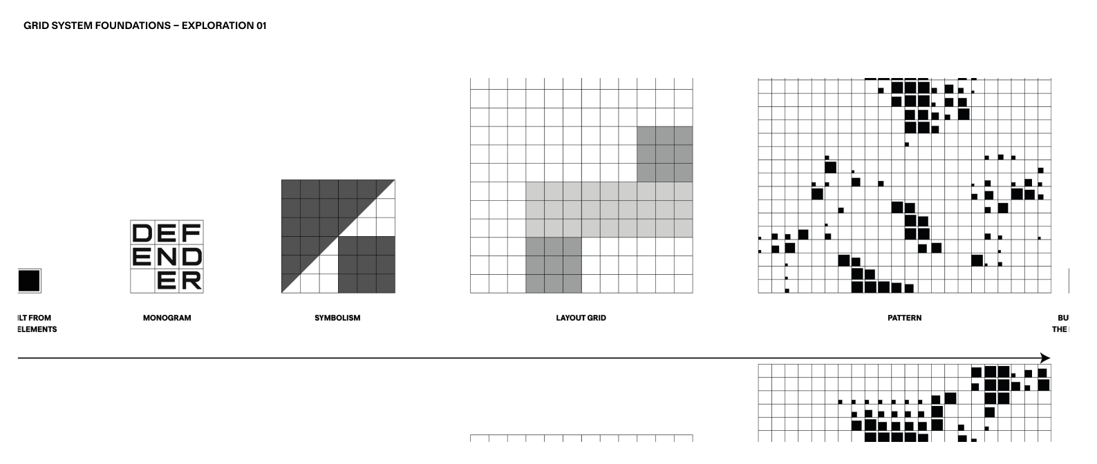
Built from the elements, The Square building into 2x2, 3x3 grids

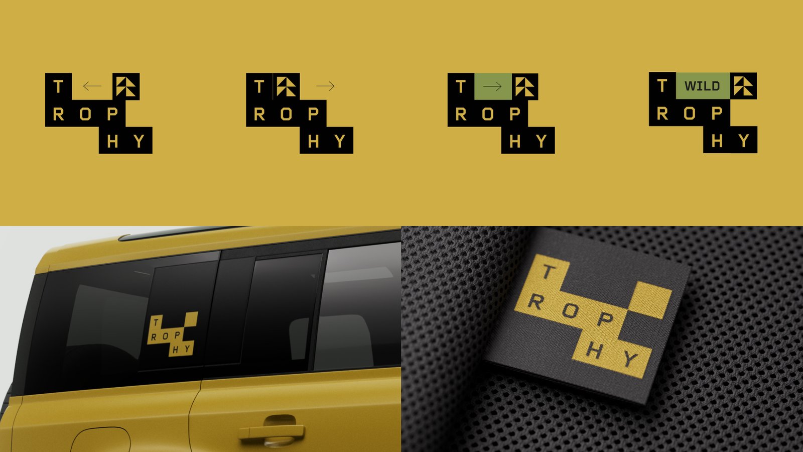
APPROACH
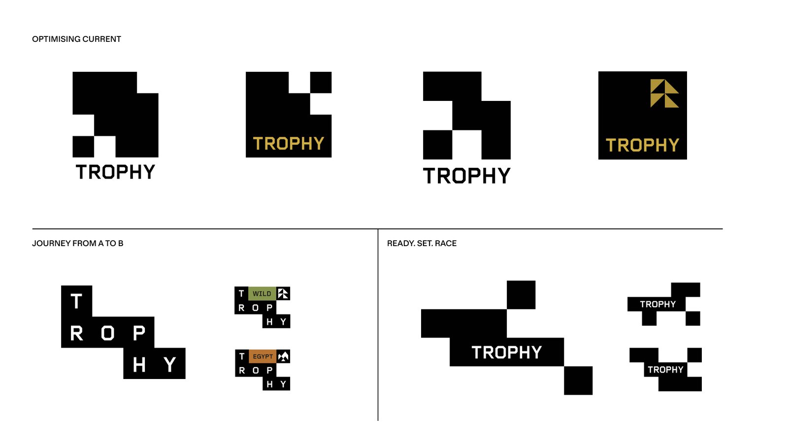
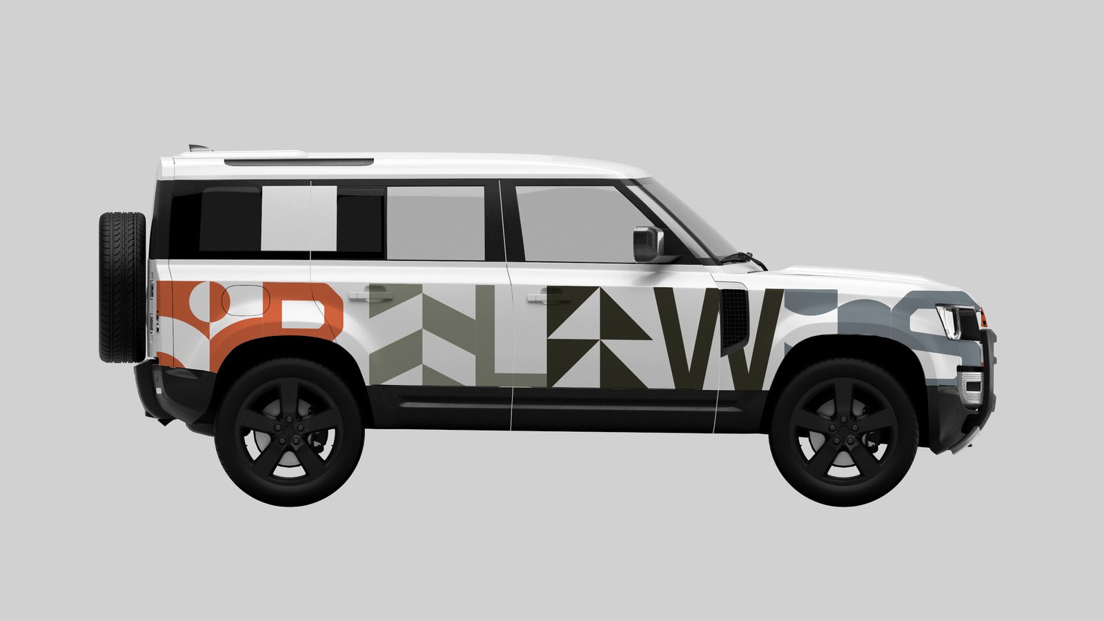
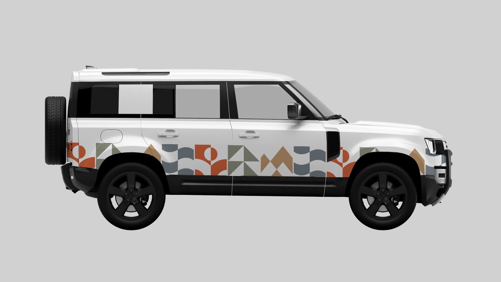
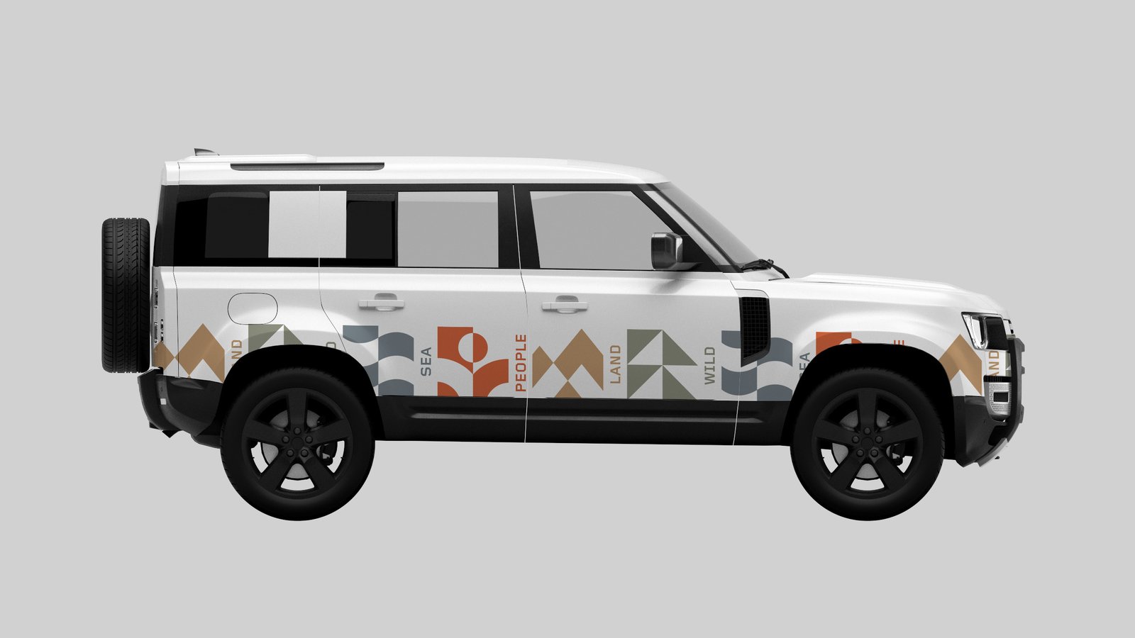
A logo lockup supported by a visual system that works for any purpose and in any situation.

Built from the elements
Flexible grid-based lockup
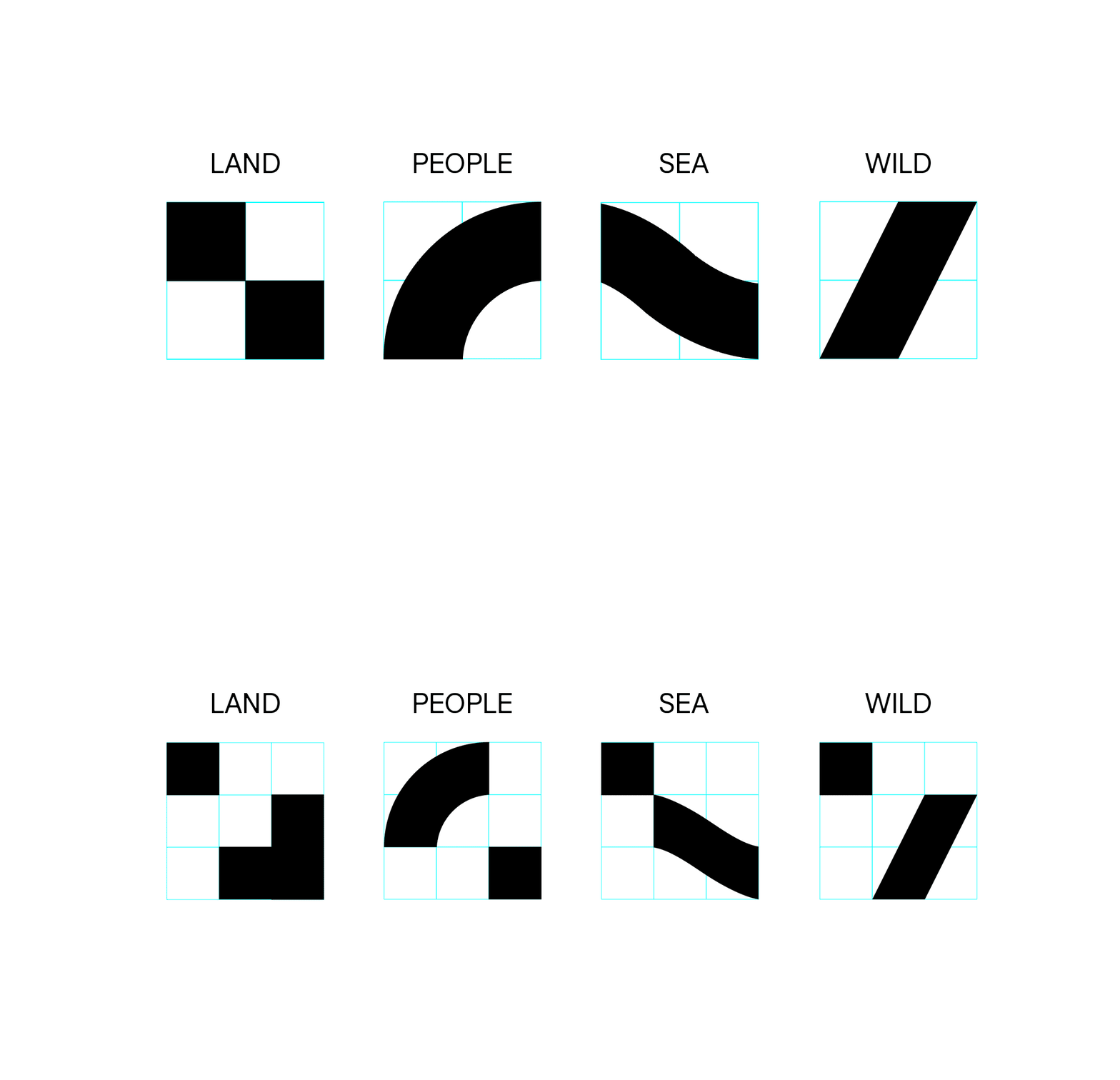
Responsible Endeavour Culture Human in nature Community
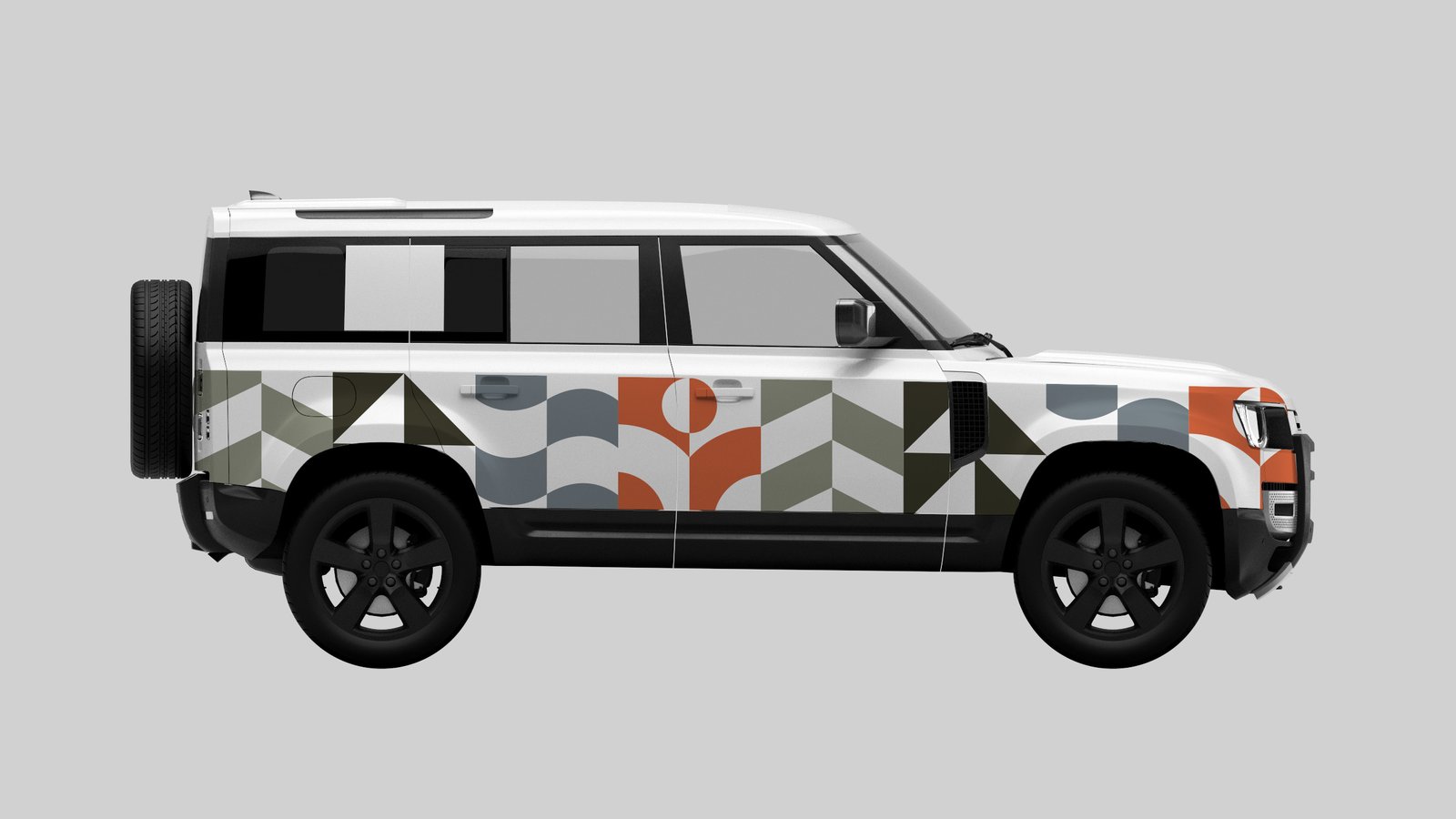
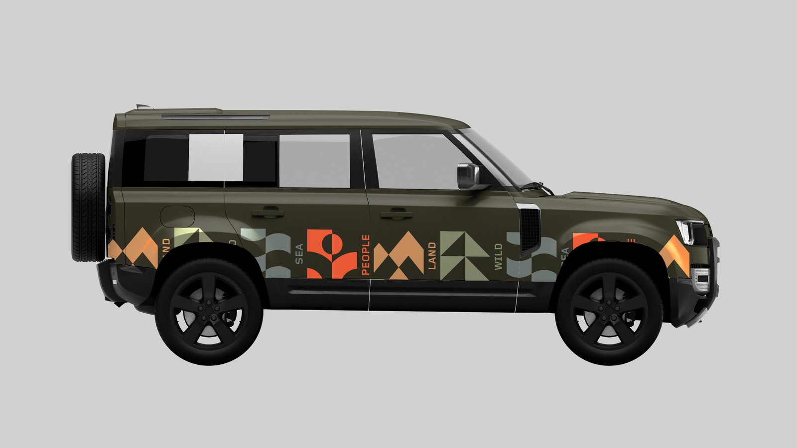
THE PROCESS
Start from the purest building blocks. Driven by function, everything serves a purpose.
Designing for the lasting change, supporting people and the planet.
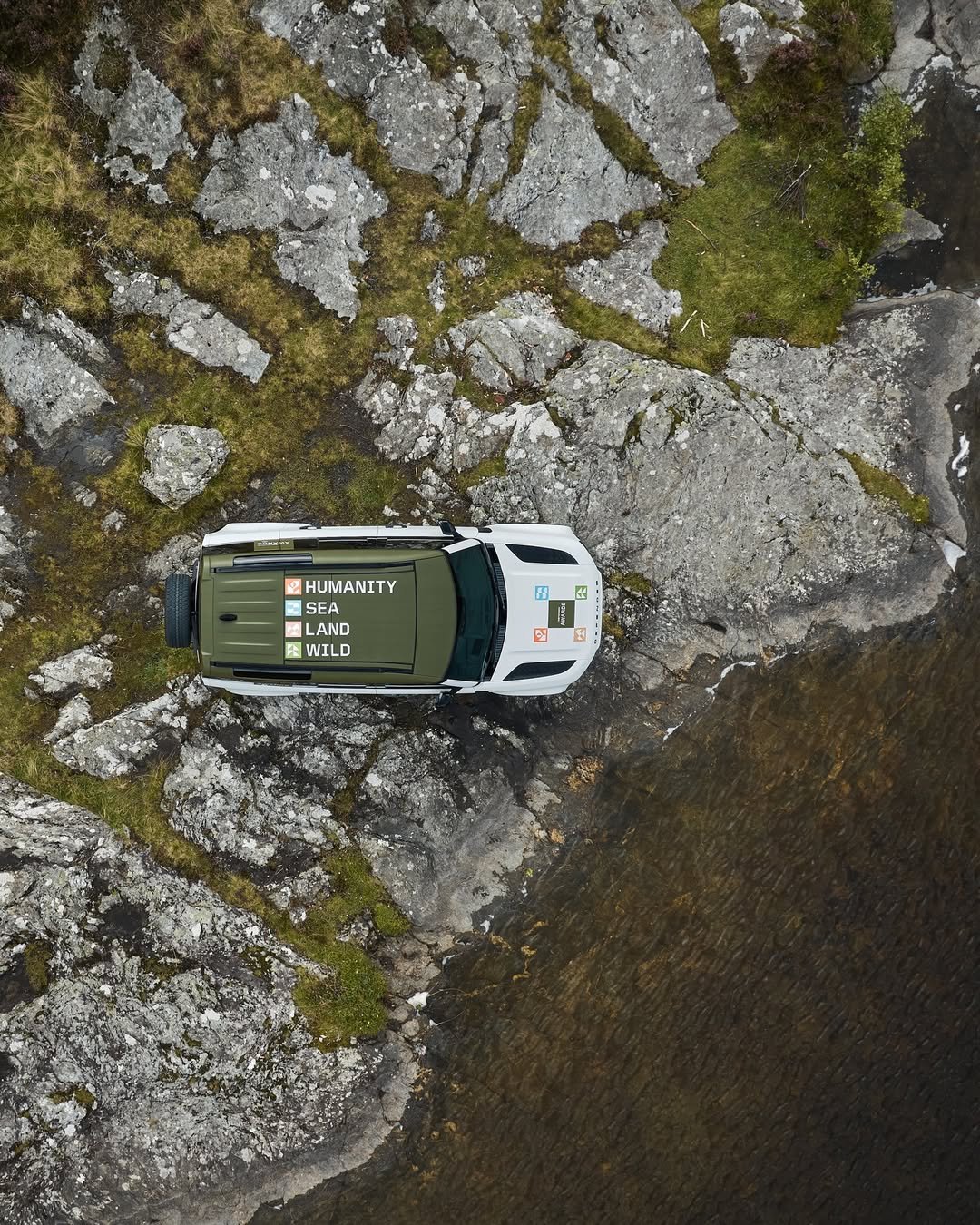
Nature inspired colour palettes
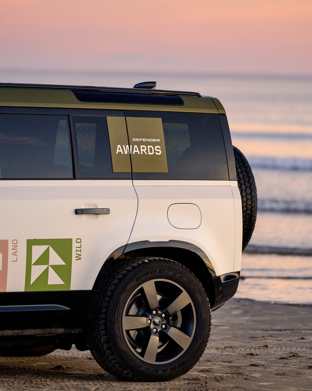
Lead with grid-based graphic system
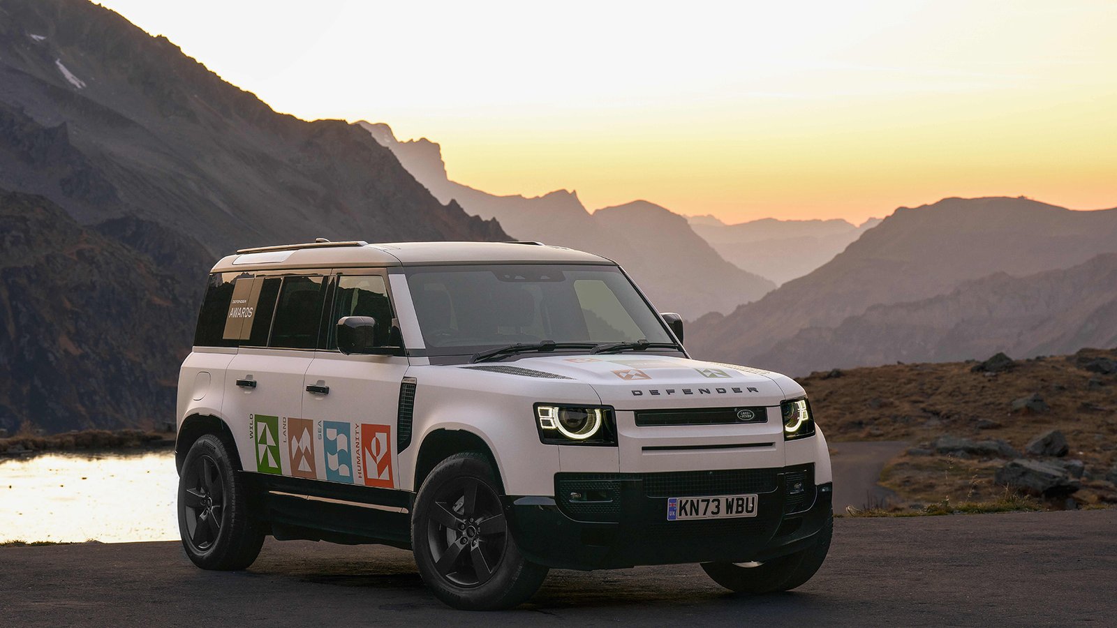
RESULT
A testament to the spirit of humanity, Defender connects people to the power of nature, community and culture. The design language embodies the simplicity to represent the force of nature and the power to protect what matters most.
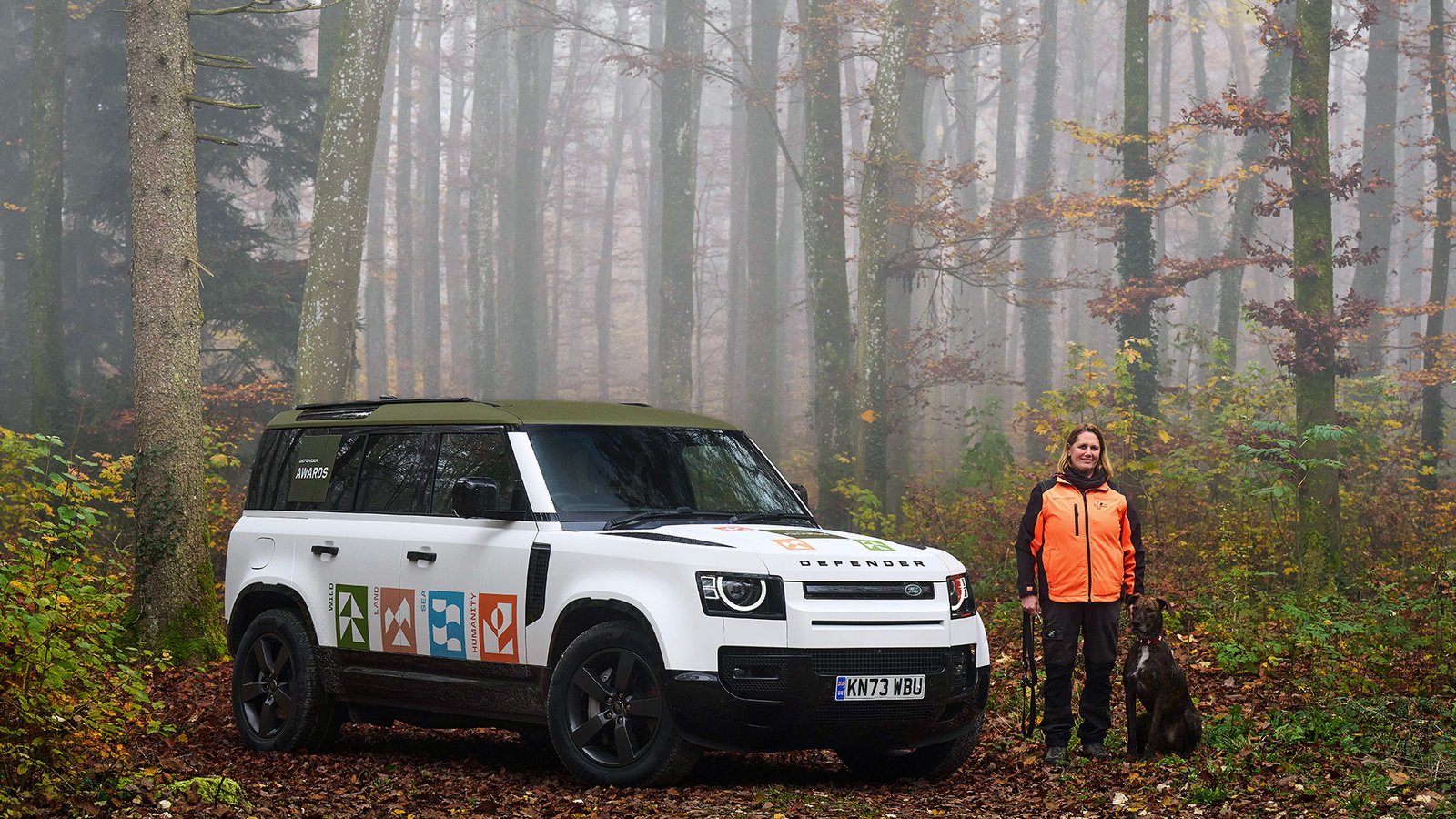
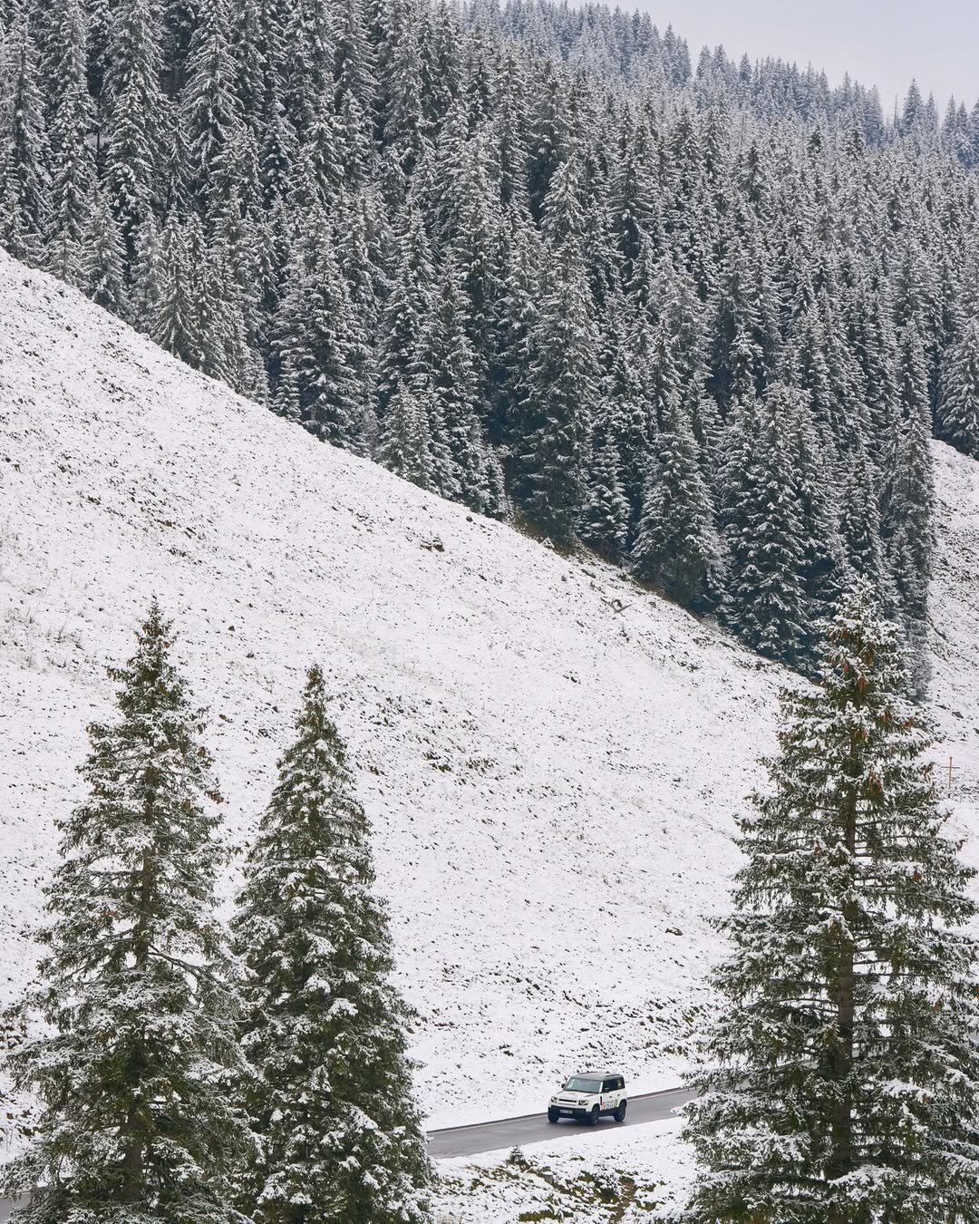
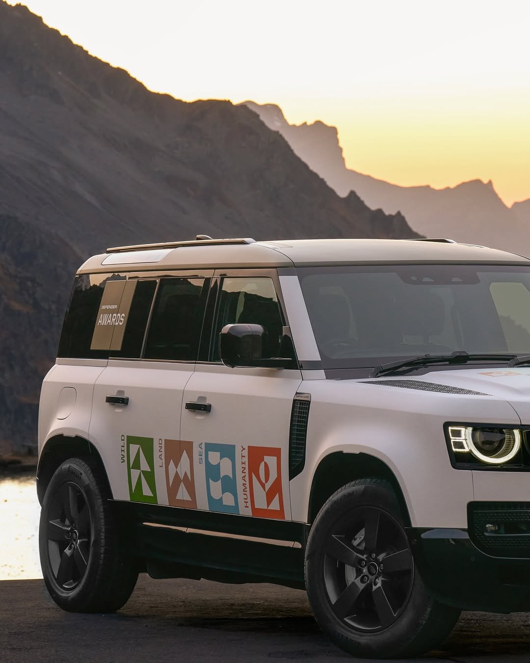
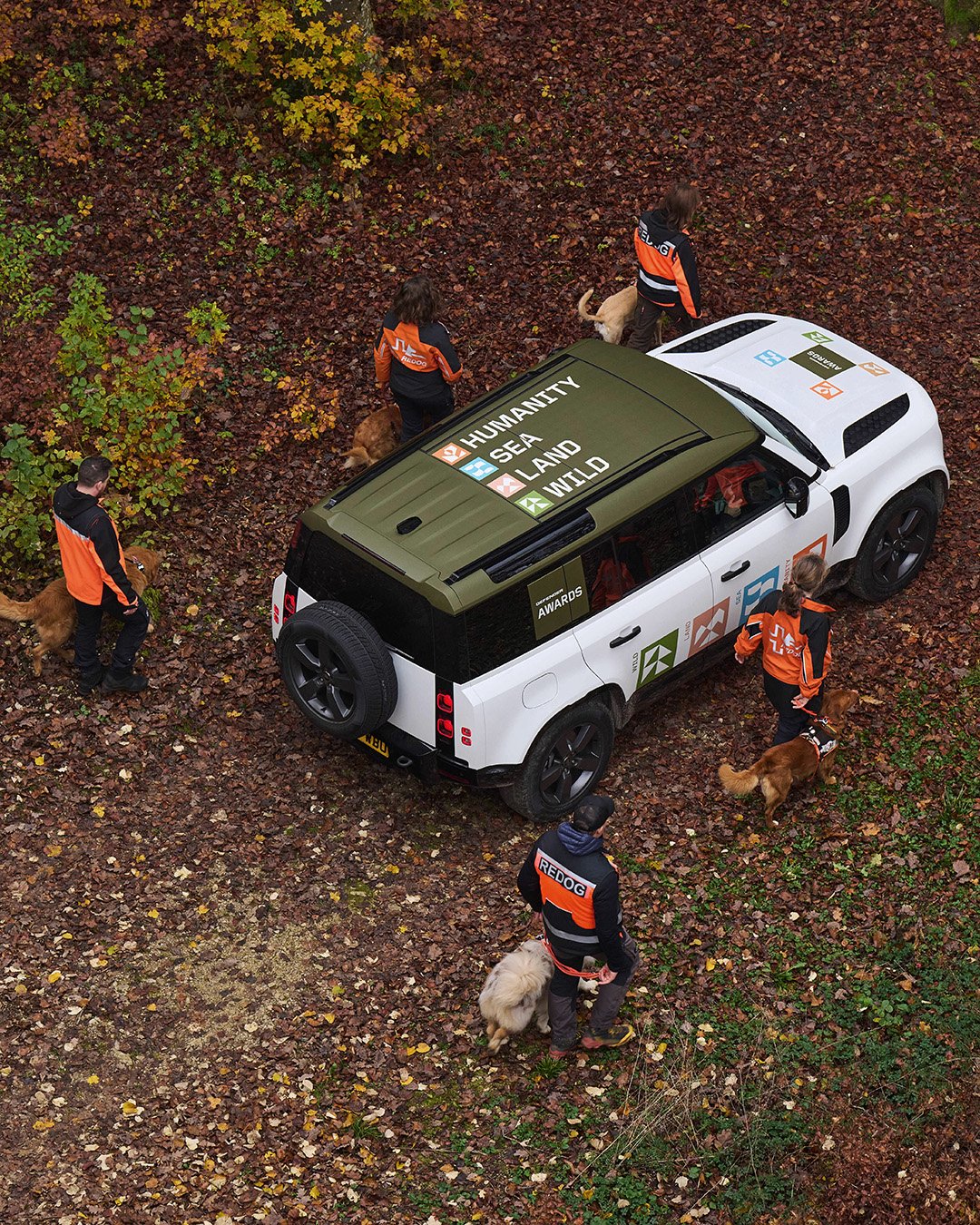
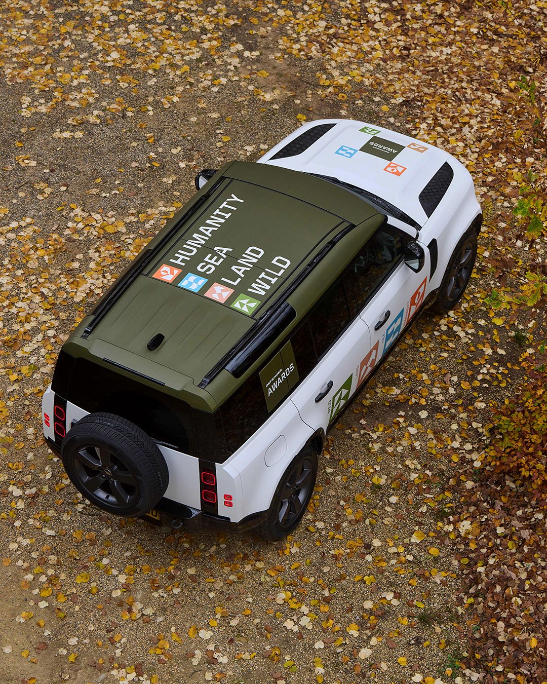
Role: Concept development and visual design. Worked with creative director, design director and motion designer. A project with Ultralight.
yuen.luu@icloud.com
+44 (0)7542090218 | Manchester, UK